
Over the past few weeks you may have noticed a few annoying things about my blog. I certainly did:
- Right-hand columns show up ages after everything else.
- Right-hand columns are a morass of AJAX and links nobody uses anyways.
- Teeny tiny links for important stuff like About.
- Missing Contact page.
- Indications of what the hell this site is about, since I serve at least three different audiences.
- Articles that get lots of hits disappear into the massive date archives.
- Articles are massive blocks of text.
- Georgia is kind of unreadable in places.
- etc.
So I spent most of Sunday–that would be eight hours by now, I think–revamping this blog.
First I read the following articles from Skelliewag, who knows quite a few things about blogging in all its Vishnu-like aspects:
Hallelujah, someone who speaketh plainly about such things!
So I went on a redesign rampage. (During this time some poor person was browsing the Sherlock Holmes tagged entries, and I apologize. It should all be settled by now.)
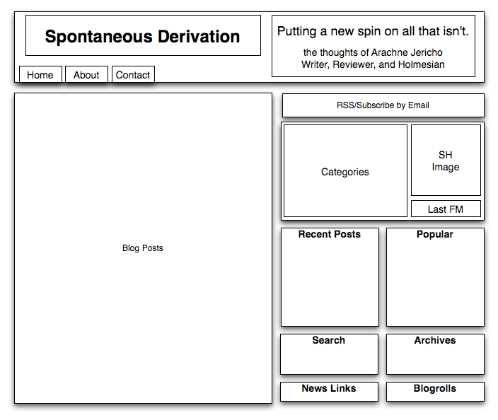
In case anyone is interested, here is the OmniGraffle document depicting the framework of what I eventually used.
Front Loading Site Info
Because of the magic of div and float, I was able to put my right-side columns before the left-side content, and still have it all work. Now my right columns load up much earlier.
More importantly, I moved the menu bar into the header proper, as well as an overall description of this blog. (Damn it, it seems like I can never shift content into this thing fast enough.) I added back the Contact page.
Now when my blog loads, you get the header with menu and title, and then the side items, and then the content.
Now I needed to make the side items load much faster.
Weed-whacking the Sidebars

Next, I started cutting content out of the right columns. Trust me, from weeks of peering through Google Analytics and Performancing Metrics, I know that people don’t use the massive linkage on the right hand side very often. Maybe once out of 100 visits someone–who isn’t the owner of a site on the blogroll–will click on a blogroll link, for instance. I think in two months I saw all of two clicks (out of 1000 visits) that weren’t my own on the Feed Radiation and Regular Integrals features.
At this point I just created a separate page for them, with two sections (links found web surfing, and link rolls) linked from the side columns.
I created several archive pages by hand, organizing my more timeless articles into groups. An good example–since this is currently most of the content on this site–is the On Writing archive.
I removed, though it grieved me, the Last FM widget, but added a link in the upper right for people who want to pop up the widget anyways, so they can keep an eye on me as I write.
Then I went through all my posts and selected the ones that had the most comments, or the most hits (in the case of the Chinese Tonic Soup one…) and stuck them on the sidebar under “Popular Derivations”.
I straightened out the rest of the Interesting Categories box, merging it with the profile box. Up on top I stacked the subscriptions links in a neat row, and nuked the two old subscription boxes.
Readability
I changed the fonts of most things to Verdana and enlarged the text on the right side. I removed justification as well, because it tends to cause more problems than solve them, readability-wise.
Whack Backgrounds
I’ll figure out what to do with them later. But the old backgrounds were way too slow to load, especially since it took ages to tile the middle of the page, where the important text is.
And then it was over….

Whew.
Anyways… there it is. At some point prettiness, or at least different colors, will be added back in. But right now, content rules, and design obeys (as much as it can).
And yes, Spontaneous Derivation is still hosted on Blogger. Back atcha, WordPress guys.

Whew! You put a lot of work into your blog, girlie! Me? I’m such a slacker. A plain template and a few kittehs with funny translations and I’m good to go.It’s kinda humbling.
Well, arguably I am crazy. :) Thanks, Mary!I think I’ll keep it this way for a while. It’s not very much different from the old design, while being an improvement in some ways–apart from the paper background, which I do so miss, but was slow to load even on my bandwidth.Oh, the pretty toys… I miss them so.